 The lights of Times Square seem to have made their way into a museum. Bring your sunglasses and head to Madison Avenue and East 75th Street.  Now through May 31, 2009 at the Whitney Museum of American Art is an exhibition of Jenny Holzer’s work entitled, Protect Protect. Known for incorporating text into her artwork, Holzer uses language in a variety of ways in this exhibition in her benches, paintings and electronic displays. Included in the exhibition are a number of electronic sign pieces (LED works) comprised of text scrolling across horizontal screens grouped in particular arrangements. This use of flowing text in lights recollects newsreels or advertisements yet they are manipulated into works of art or projects with multiple reels and personalized in their color, font, word placement and other spatial and visual concerns.
The first and largest work in the show, For Chicago, 2008 includes 10 rows of text playing on large, flat screens laid out across the floor in the center of the exhibition. The text comes from Holzer’s earlier writing, including Truisms, 1977-79, Inflammatory Essays, 1979-82, and other text works done between 1997 and 2001.  Truisms, Holzer’s term for short, catchy groups of words are sometimes just random phrases and other times are well known sayings. The artist has displayed them in various ways over time, on benches and in paintings as well as in her LED pieces. In For Chicago, Holzer then transforms the words and phrases into a super-highway of information as the yellow words (the color of the center divider on a roadway) fly across their black pathways, often running in both directions. They seem to be telling us about traffic and the urgent need to be somewhere faster than is possible. “I am losing ground.” “I am losing time.”
The other LED pieces in the exhibition physically incorporate themselves into the structure of the space in different ways. Green Purple Cross & Blue Cross occupy the corner of the next room with crisscrossing display panels forming a cobweb-like maze at the intersection of the two walls. Across the room, Monument encompasses twenty semicircular electronic LED screens stacked, one atop the other like a silo beginning a foot and a half off the ground, to the ceiling with each projecting its text in red or blue.
In sharp visual contrast to the bright lights and flash of the LED displays, Holzer has done a series of paintings called the Redaction Paintings, 2005-09. The text reproduced and presented in these paintings comes from a source Holzer has been using since 2004: declassified pages from United States government documents. My first look at one of the paintings this afternoon was arresting. The text seemed to perfectly mimic the front page of today’s paper with the story of the Obama administration’s release of CIA torture memos of prisoners during the Bush era. Talk of forced grooming, sleep deprivation, removal of clothing and using prisoners’ phobias (such as the fear of dogs or bugs) to induce stress appear in the news today and on the walls of the Whitney in Holzer’s prescient Redaction Paintings as if they were done just today with current events in mind. The works are executed in black and white and incorporate typed and handwritten memos, palm prints and emails with the names of the parties and other high confidential details blocked out for security purposes prior to declassification. Some of the pieces include identifiers such as “Secret” or “Unclassified.”
In the next three LED display pieces Holzer incorporated the text of the U.S. government documents, rather than her own writing, in Thorax, 2008, Red Yellow Looming, 2008 and Purple, 2008. The pieces serve as vibrant yet silent protests of the tragedies uncovered in the government files. Interspersed throughout the room of paintings are Holzer’s signature benches with text phrases carved into the seats.
Whitney Museum of American Art, 945 Madison Avenue, New York City.
 Seven Days In The Art World‘s book jacket depicts a sexy high-heeled female leg disappearing behind a corner of an all-white space that could only be an art gallery and leaves viewers wondering what could be behind this wall. Sarah Thornton’s recent book tells us. Thornton reviews and explores the contemporary art world from various perspectives and hits upon its various pressure points, exploring the trends, the players and the activities that make this world the glamorous and shady world it is. Or at least it was until the market downturn… The book’s chapters, devoted to the auction, the crit, the fair, the prize, the magazine, the studio visit and the biennale, provide a first-hand look at the deals and details of each of these places.
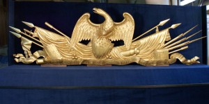
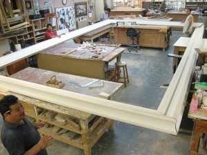
 I recently had the pleasure of visiting Eli Wilner & Company’s studio in Long Island City, New York to see an incredible work in progress, the new frame made by the firm for an important American painting, Washington Crossing the Delaware, 1851, by Emanuel Leutze. This painting, the largest of the various versions produced by this German American artist, measures 149 x 255 inches (approximately 12 x 21 feet) and depicts General George Washington proudly leading the charge across the Delaware River to Trenton, New Jersey on December 25, 1776 during the Revolutionary War. The painting and its impressive new frame form part of the Met’s American Wing which is in the process of being totally renovated with the third and final phase of the project scheduled for completion in 2011. The grand opening of the new space took place yesterday in the presence of dignitaries, politicians and the New York elite as First Lady Michele Obama spoke to the crowd as part of her cultural visits around the city. In two years, this grand painting will hang on public view at the completion of the renovation project.
 Paul Cezanne (1839-1906) has been revered and studied by successive artists since the end of his career. In this exhibition, Cezanne and Beyond at the Philadelphia Museum of Art, Cezanne’s work is shown alongside that of eighteen Modern and contemporary painters and sculptors from Picasso and Matisse to Ellsworth Kelly, Brice Marden, Jasper Johns and Jeff Wall, all of whom who were and are inspired by Cezanne’s revolutionary planar landscapes and portraits, composite still lifes and grand bathers. Breaking free from academic tradition, yet still painting recognizable landscapes, still lifes and portraits, Cezanne charted a course towards seeing the geometry in everything and capturing the fragmented surfaces and planes which led future artists such as Pablo Picasso to identify Cezanne as the father of Modernism.
 The lights of Times Square seem to have made their way into a museum. Bring your sunglasses and head to Madison Avenue and East 75th Street.  Now through May 31, 2009 at the Whitney Museum of American Art is an exhibition of Jenny Holzer’s work entitled, Protect Protect. Known for incorporating text into her artwork, Holzer uses language in a variety of ways in this exhibition in her benches, paintings and electronic displays. Included in the exhibition are a number of electronic sign pieces (LED works) comprised of text scrolling across horizontal screens grouped in particular arrangements. This use of flowing text in lights recollects newsreels or advertisements yet they are manipulated into works of art or projects with multiple reels and personalized in their color, font, word placement and other spatial and visual concerns.